

TL;DR
- Before any code: a brand turned into a design system, then a sketch, a mockup and a prototype.
- Designing first means less rework, a clearer idea of what the client wants, and fewer agent tokens.
- A design rule works only when a test checks it: 575 colours got past mine.
An AI agent can now build a working screen in minutes. So it is tempting to skip design and go straight to code. This article explains why I do the opposite, in a fixed order, and what each step looks like in Tendero, the ecommerce platform this series builds.
There are three parts. First, why design comes first. Second, the three design documents: the sketch, the mockup and the prototype, with the tools I use for each one. Third, the code, which is the easy part when everything before it is defined. But one thing comes before all of them: the design system.
Before anything: the brand becomes a design system
Every project starts with a brand. A client usually has one: a logo, colours, fonts, a way of speaking. If not, you define one with them. Either way, this is time well spent, because everything after it depends on it.
The brand becomes the design system: a small set of named values and rules that every screen uses. Tendero’s design system existed before the first screen. It is three files:
design/tokens.css— every colour, size, space and font, as named CSS variables. These are the design tokens.design/DESIGN.md— the rules, and the reason for each one.brand/BRAND.md— the logo, the colours and the tagline.
The design system also has its own sheet, drawn on a design canvas from the values in tokens.css. This is how it looks on the canvas:
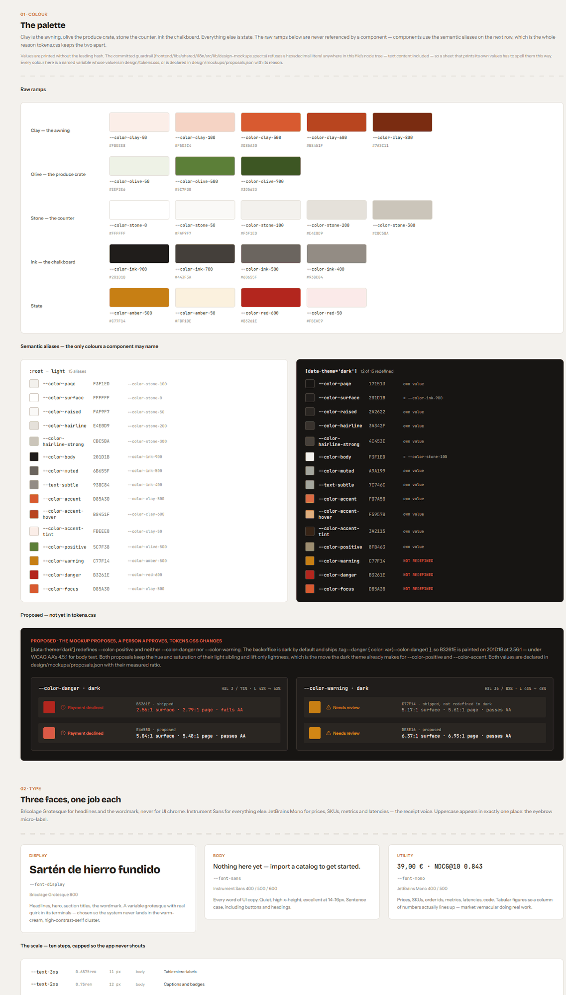
The full sheet is in the public repository: design/mockups/design-system.html. Download it and open it in a browser to see every section, or read its source, design-system.pen, in the same folder.
Some rules are about taste, but each one has a written reason. There is no serif display font. Warm cream, a high-contrast serif and a clay accent together are what AI-generated design usually looks like today. Numbers always use a monospaced font, because a shop shows figures in columns, and a column of prices should line up. Each view has one clay action. If two things are clay, neither is the main action. And anything an AI agent did is shown in clay, so a person can see at once what an agent bought.
The most important rule is the simplest one: never write a colour anywhere except tokens.css. Part 3 shows why that rule needed a test.
1. Design first
Why design before code, when the code is so cheap now? For three reasons.
- It avoids going back and forth. A change on a drawing takes a minute. The same change in code means a new branch, new tests and a new review.
- It helps the client say what they want. Most people cannot describe a screen, but they can point at a drawing and say «not like that». A design turns a wish into something you can agree on.
- It saves the agent’s tokens. Every «that is not what I meant» is one more conversation with the agent, and every conversation costs tokens. A screen that is clear before the agent starts is built once.
Tendero learned this the hard way. In the first week, two rounds of wireframes were made. The first round, in its own words, was «for a different product». The second round was «rebuilt from the code», after the screens existed. So the design that should come first came last. The screens that shipped worked correctly, but they did not look like a shop. That is a later article.
So this is the order I follow for every new screen:
- What must the users be able to do? Write one sentence per screen.
- An ugly sketch. Grey lines, no colour, nothing that looks finished.
- A mockup, when the look needs a decision: the real colours and content.
- A prototype you can click.
- Code. The design system grows with the screens.
Step 1 has a name today: spec-driven development. Tools such as GitHub’s Spec Kit (MIT), OpenSpec (MIT) and AWS’s Kiro turn it into a process for the agent. First a spec says what to build and why. Then come a plan and a list of tasks. Only then comes the code. Tendero uses a lighter version. Each feature has a short spec in docs/specs/. CLAUDE.md holds the rules that every spec must follow. For larger work, the superpowers skills for Claude Code add a written design and a plan before any code, in docs/superpowers/. A decision record, ADR 0009, says why Tendero did not adopt Spec Kit at the start (the next lines explain what an ADR is). It also plans to try Spec Kit on one feature and compare. That test has not happened yet. When it does, it will have its own article.
The decisions come first too: ADRs
An ADR is an architecture decision record: a short document about one decision. It says what the problem was, what we decided, and what that decision costs. The idea comes from Michael Nygard, in a 2011 article. Tendero keeps its ADRs numbered in docs/adr/, and there are 31 at this article’s tag. Code shows what the project does. An ADR keeps why. A decision is never deleted: when a new ADR replaces an old one, it says so, and the old one stays.
Five of them are as old as the plan. That plan, docs/initial-plan.md, calls them «the five founding ADRs», and they were drafted with it, before the solution was generated: one folder per feature, bounded contexts that share no entities, external systems behind ports, lexical search as the permanent fallback, and which library does what in the AI layer. That is design before code again, this time for the architecture.
The other twenty-six came with the work. The rule that creates them is part of the Definition of done in CLAUDE.md: «new decisions recorded as ADR if they constrain the future». So a change does not get an ADR for being large. It gets one when it limits what comes after it. In practice the agent drafts the ADR together with the change, and I accept it when I review that change. CLAUDE.md then names the ADR by its number beside the rule it explains, so the rule stays one line and the reasons stay in the ADR.
This matters more with an agent than with a team. An agent remembers nothing from one session to the next. It reads CLAUDE.md at the start of every session, but it does not read the ADRs then: there are too many, and most have nothing to do with the task of the day. It opens one when a rule in CLAUDE.md or a comment in the code names it. That is why the number beside the rule matters: an ADR that nothing names is an ADR the agent will not find. When it does open one, the ADR is how it learns why the code is the way it is, before it «fixes» a decision by undoing it.
2. Sketch, mockup and prototype
The ladder, written down in 2013
In 2013 I started a book called De 0 a N con Task[in] («From 0 to N with Task[in]»). It took me thirteen years to finish it. It is now free to read online, in Spanish. Its third chapter, «Don’t start yet: first, the prototype», describes four kinds of design document. Each one grows out of the one before it. Translated from the Spanish:
- Sketch. A simple drawing on paper of a general idea, kept short and simple, without many details.
- Wireframe. A static picture of low quality, usually in black and white.
- Mockup. A static picture of medium quality, in colour, that shows the basic features.
- Prototype. A version of the final product in HTML, PowerPoint, animation or any other format you can click through, so that the user can interact with it.
The book then made a recommendation: make at least one of the first three and a prototype. Use them to answer one question: what must the users be able to do?
That advice still holds. Two things changed. A design system now comes before the ladder, so a mockup never has to invent its colours. And an agent now draws each step for you. In Tendero, Claude Code draws them, while I describe what I want and check the result. It reaches each drawing tool through MCP, the standard way to give tools to an AI model.
The sketch: decide what the screen is for
A sketch has one job: to decide what a screen must let a person do. Nothing else. It is the cheapest design document, and that is its whole value. You should be able to argue with it and throw it away. That is why it has to look unfinished. A finished look starts a discussion about the colour of a button before anyone agrees what the page is for.
Here is the storefront home as a sketch. Its question is at the top: find something without knowing its name. The notes in the margin are the decisions, such as «a row you scroll, never a carousel»:
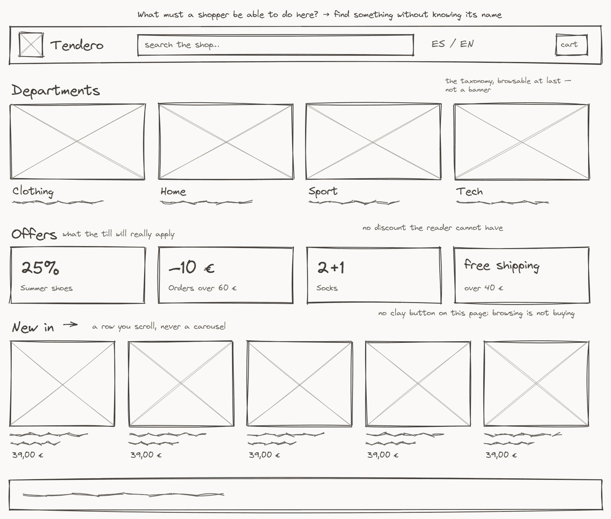
To be clear, the storefront home and the backoffice review queue were sketched after their screens were built. I drew them for this article, so you can compare a sketch with a real screen. But one sketch came before its code, and it shows what a sketch is for.
The next part of Tendero is a queue. In it, a person reviews what an AI model extracted from a product description. The model proposes a claim, such as «works on induction hobs», with its evidence. A person approves or rejects it. A model never writes to the catalogue directly. I sketched that screen before any of its code existed. The code at this article’s tag still has none of it. The queue was built later, and a later article tells how.
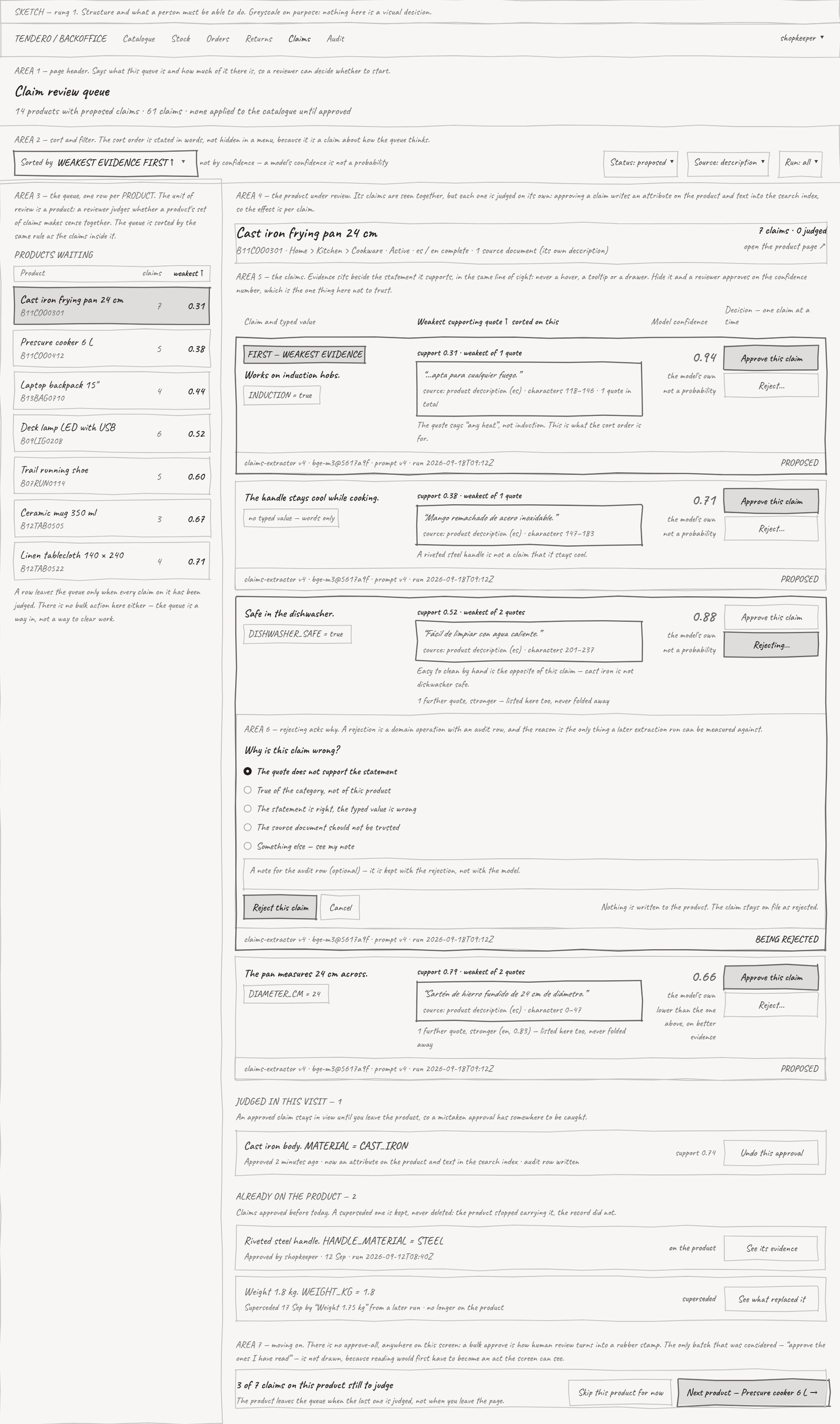
Drawing it found three contradictions between rules. Each rule looked reasonable on its own:
- Sorting by the weakest evidence makes it easy to reject without reading. The claims most likely to be wrong come first. A tired reviewer could reject a whole page in a few clicks. The rule against bulk actions only covered approving.
- Two rules needed the same space. Evidence beside each claim needs width. Reviewing one product at a time needs width too. With somewhere between seven and twenty claims, the second rule stops working.
- A claim with no evidence had nowhere to go. And that was the most important thing the screen could say.
No test could find any of these, because there was no code to test. This is the real reason to sketch: it is the cheapest place to find out that your rules disagree with each other.
Two canvases for the sketches: pen.dev and Excalidraw
I drew the sketches twice, on two canvases. Both keep the design as a JSON file in the repository, next to the code, and an agent draws on both through MCP.
pen.dev came first. It is a design canvas that runs inside Visual Studio Code, as an extension. Its best feature is variables: a design can say $ink-500, the name of a token, instead of a colour value. But using it takes several manual steps. VS Code must be open, with the extension signed in. You create the empty .pen file first, and you save it by hand. Some problems came from that. The agent changed the wrong file when another tab was active. One sketch was lost when I renamed a file before saving it. And pen.dev’s own PNG export was empty on my machine. It is free until its paid plans start. As of October 2026, its pricing page says the plans are coming soon: the free plan keeps MCP access with five days a month of work with an agent, and Pro will cost $16 per user per month. So in this project it was always an experiment, with a written condition for removing it. It still is, and today it is also the tool that draws the mockups best.
Excalidraw came second. It is an open-source whiteboard (MIT) with a hand-drawn look, which is exactly right for a sketch, and it has an official MCP server. I asked Claude Code to draw the same three sketches again, and the work was simpler: no file to create first, no editor to keep open, nothing to sign in to, and no saving by hand. Its hand-drawn lines are built in. It has two limits. It has no colour variables, so every colour is a hexadecimal value in the file. And its MCP server is made for a chat window: it does not write the file in your repository, so a few lines of code export the drawing to a .excalidraw file and a picture.
A third option, which I have not tried, is Penpot (MPL-2.0). It is a full design tool that you can host yourself, and it also has an official MCP server.
The mockup: the real colours and content
A sketch has no colour on purpose. The mockup adds the colours of the design system and real content. I asked Claude Code for the storefront home as a mockup in Excalidraw, with the real pictures and prices of the catalogue:
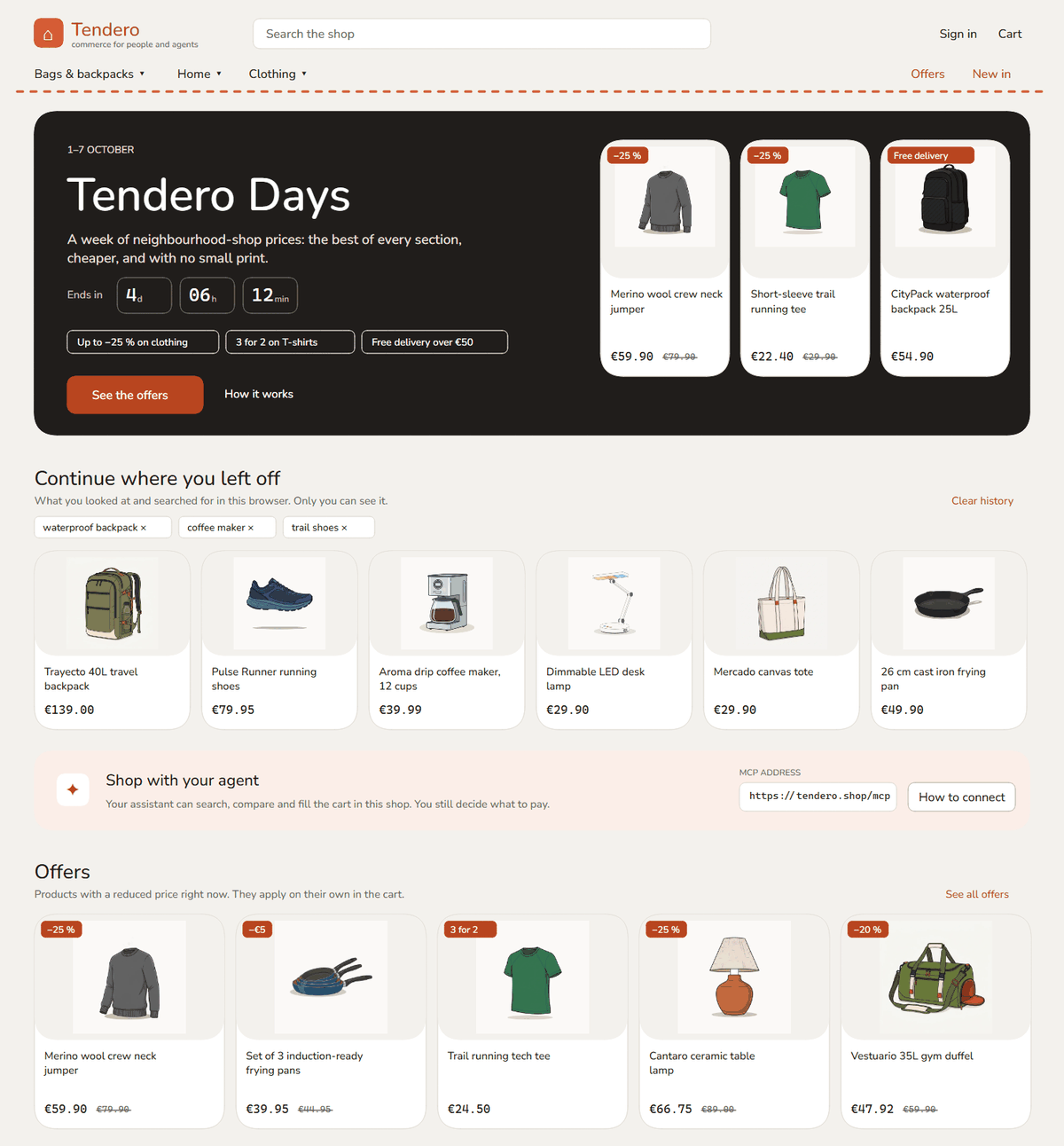
It took one try, and every colour in it is a token. It shows the structure and the colours well. But it also shows where Excalidraw stops. It cannot use the brand’s fonts, so it uses Nunito and Cascadia, not Bricolage Grotesque, Instrument Sans and JetBrains Mono. It has no font weights, so the titles are not bold, and the page’s hierarchy is weaker. When a mockup must show the type in detail, pen.dev is the better tool, because it uses the real fonts and the token variables.
Later in the project I had the chance to test that. Six screens of one feature were drawn in both tools, first in Excalidraw and then in pen.dev. Excalidraw redrew all six from a script in seconds, with no editor open. But every position was calculated by hand, the text was Helvetica, and the product pictures were empty boxes. pen.dev used the shop’s fonts, a real picture, icons and the tokens by name, and its layout sized itself. I chose pen.dev after seeing one screen in both. The Excalidraw set worked better as a sketch with notes in the margin, and that is the step where it belongs.
The prototype: something you can click
A sketch answers what must a person be able to do here? A mockup shows what the page will look like. Neither can answer the next question: does it feel right to use? For that, you need something you can click. The 2013 list called it a prototype: «in HTML … so that the user can interact with it».
So in Tendero, a prototype is HTML: one HTML file, with JavaScript where it needs behaviour, kept in the repository. If someone needs a link, Claude Code can also publish the same page as a Claude artifact, a real web page on claude.ai. That is optional. The HTML file is the prototype.
I did it for the claim review queue. The sketch gave the prototype its structure. The design system, which already existed, gave it its colours, fonts and spacing, so the prototype looked like Tendero from its first version. It took one conversation. The file is design/prototypes/claim-review-queue.html.
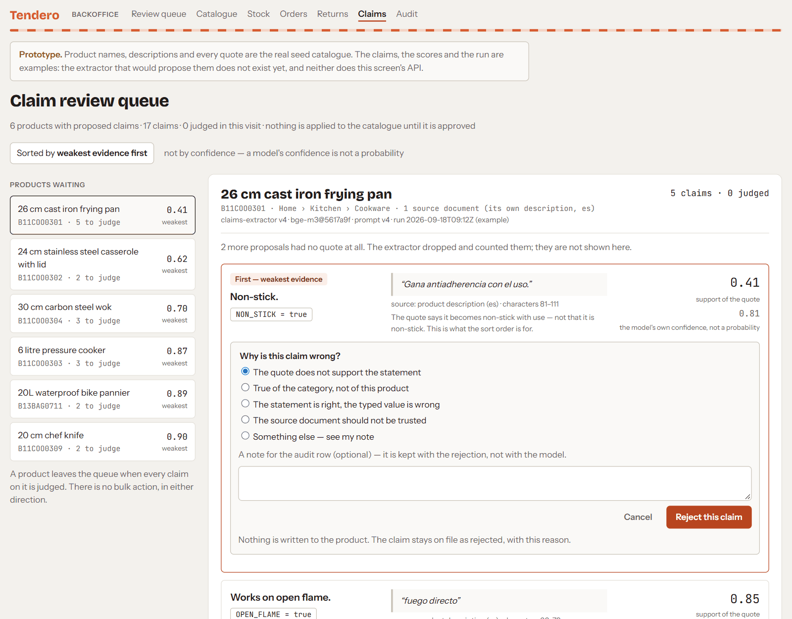
It uses real data. This repository has a rule for prototypes: they use a real response from the API, not invented numbers. This screen has no API yet, so the prototype uses the real catalogue — product names, descriptions and every quote — and says on the page that the claims and scores are examples.
That rule paid off at once. The sketch had invented its quotes and one measurement: it says «24 cm» for a pan that is 26 cm in the catalogue. The prototype used the real descriptions and found something better. A wok’s name and description say «acero al carbono» (carbon steel), but its catalogue attribute says stainless steel. This queue exists to show exactly that kind of disagreement to a person. Now it has a real example.
What Tendero uses for each step
- Sketch: Excalidraw.
- Mockup: pen.dev. Excalidraw can do a first one quickly, but it cannot show the brand’s type.
- Prototype: an HTML file (with JavaScript when needed) in the repository. A Claude artifact is an option when someone needs a link.
Is a prototype worth making? My answer is clear when you want the client or the final user to try it: yes. When the work does not need that interaction, I would say you can go almost straight to the code. That is only my opinion, and it depends on the case.
3. Then the code
With a design system, a sketch and a prototype, the code is the easy part. The agent knows what to build and how it must look. A working Angular screen takes minutes. In 2016, Kara Pernice of the Nielsen Norman Group gave the old reason for the ladder: «Ripping up code is very expensive. Ripping up a prototype is not, especially if it’s just a piece of paper.» With an agent, code is no longer so expensive. But her second reason is still true: «when a design looks very polished, it’s easy for an executive to fall into the trap of saying, ‘this looks good, let’s make it go live now.'» A working screen looks finished. That is exactly why the sketch before it must stay ugly.
What the code needs now is rules, so that the agent builds every screen the same way. In Tendero they live in three places.
CLAUDE.md holds the conventions the agent must follow. For the frontend: colours come only from the tokens, never a hexadecimal colour in a component; one clay action per view, and agent actions always in clay; an Angular component is three files, its class, its template and its styles, so that every HTML and CSS tool can read them.
Tests hold the rules. A rule that no test checks is only a wish, and Tendero found that out. The rule «never write a colour outside tokens.css» had no test for five days. Then a test came: it reads every .css file in the repository and fails on any colour outside the token file. But it had a gap. The two wireframe documents from the first week were HTML files in docs/design/, not .css, so the test never read them. Together they had 575 hand-written colours: 193 in the storefront design and 382 in the backoffice design. Nobody saw them for about two weeks.
The fix was another test, not a promise to be more careful. design-mockups.spec.ts reads every design file in design/ and fails on any colour that is not a token. It caught my own first sketches: they used 166 colour values instead of token variables, and then one stray frame two pixels wide. When the Excalidraw files arrived, the test did not read them at first, because it only knew .pen and .html files. Now it reads .excalidraw files too, because Excalidraw has no variables and its colours must be checked one by one.
ADRs hold the decisions, as part 1 explained. Two of them matter here. ADR 0010 decides what the two Angular apps, the storefront and the backoffice, share and what they do not, and a lint rule enforces it. ADR 0033 decides that a design document is disposable, and that a design tool is an experiment with a condition for removing it.
A note for readers of the repository today. The tokens did not stay in
tokens.css. When the components moved to Tailwind, a bridge first copied each token to a Tailwind name. So every new token had to be written twice. Also, 275 sizes in the templates were not tokens at all. A later decision, ADR 0050, made the tokens Tailwind’s own theme, indesign/theme.css.tokens.cssis now generated from it, for the pages without Tailwind. Now a utility class can only use a token, and that includes sizes. The rule stays the same, only the file changes: never write a colour anywhere except the tokens. A later article tells that story. The code at this article’s tag still usestokens.css, as described here.
Summary and conclusions
- Start with the brand. Turn it into a small design system: tokens, rules and the reason for each rule.
- Design before code. It avoids rework, helps the client say what they want, and saves the agent’s tokens.
- Follow the ladder. A sketch decides what a screen is for. A mockup decides how it looks. A prototype tells you if it feels right.
- Choose simple tools. In Tendero: Excalidraw for sketches, pen.dev for mockups, and HTML for prototypes.
- Make every rule a test. A rule without a test is a wish. 575 colours got past mine, in files the test never opened.
- Write the decisions down. An ADR keeps why. Five of Tendero’s were drafted with the plan, before the solution existed.
Coming first did not make the design system correct. Later, I laid it out on a canvas and found six contrast failures. The brand colour also changed, and no test noticed. That is a later article too. The order does not make a design system right. It makes the mistakes cheaper to find, but only if the rules are tests and not intentions.
The repository is public and MIT licensed. The code exactly as this article describes it is tagged blog/01-design-before-code. It runs from a clone with dotnet run --project src/AppHost.
How we know it works
- The test that fails: write a hexadecimal colour in any
.cssfile outsidetokens.css, anddesign-tokens.spec.tsfails. Write Excalidraw’s default grey,#1e1e1e, into one of the.excalidrawfiles, anddesign-mockups.spec.tsfails. The sketches in this article failed that test before they passed: first 166 colours written as values instead of token variables, then one stray frame two pixels wide. - The check on every pull request: the frontend job runs the design system’s four test suites — tokens, design files, contrast and CSS integrity — with the other frontend tests.
- The mutation score: not yet for the frontend. Stryker.NET runs on the .NET projects only.
Next article: One port, N catalogs — why every commerce platform ends up with a folder full of importers, and what one interface and a contract-test suite cost instead.
Tendero — commerce for humans and agents.

